

Microsoft Office Add-ins Toolkits & Documentation
Introduction
In my most recent role, at Microsoft, part of my responsibilities include creating/updating/maintaining design documentation and toolkits for the Office Extensibility platform. While it may sound somewhat banal, these efforts are some of the most exciting work I've done to date, as I was able to provide documentation and tools that supported designers and developers in their work to build great products for a complex ecosystem. It turns out, it's fun to build things you would want to use and it's incredibly rewarding to shape those products based on the real-time conversations you're having with the people who use them. It's what drives me as a designer.
I had the opportunity to build the Adobe XD and Sketch toolkits/libraries that support Office Add-in design and development both internally and by Microsoft partners. It was a complex landscape to traverse: I had to consider the different capabilities of the platforms I was building for, the different personas that would be using these tools, the multitude of design dependencies that governed many of the components within, and the structure of the toolkit, which needed to be easily readable, DRY, and clearly labeled and documented.
My main collaborators were the members of the Office UI Fabric team, as the toolkits I built were subsets of the broader Fabric UI design system. They provided a great foundation from which to springboard the add-ins toolkit development as well as excellent feedback, critique and support provided as design milestones were reached throughout the process. The members of the Microsoft Planner team were also instrumental in the development of the Sketch toolkit, as they served as the first real-world use case and utilized the toolkit to design and develop a planner add-in for Office. It was fantastic to get that sweet, (relatively) unbiased feedback from another design team putting our toolkit through the paces in a real-world application - they validated the parts that worked and called out the parts that needed tweaking, polish, or trashing.
The success of these efforts - while still being measured - has been shown through the overwhelmingly positive response by the teams mentioned above as well as a marked increase in downloads of the toolkit. More in-depth data is being collected as the team continues to have conversations with partners and other design/development teams about the efficacy and use of these tools.
Design Process
Since the add-in toolkit was designed to be utilized in conjunction with the Fabric toolkit, it was designed to share much of the same structure and layout. Each toolkit was designed to take full advantage of the available technologies within both XD and Sketch, making good use of helpful tools such as symbols and overrides.
Just prior to kickoff of the add-ins toolkit, the Fabric team instituted a versioning system that we adopted as well. The toolkit starts with a cover displaying the title of the toolkit as well as the current version and a breakdown of how versioning works.
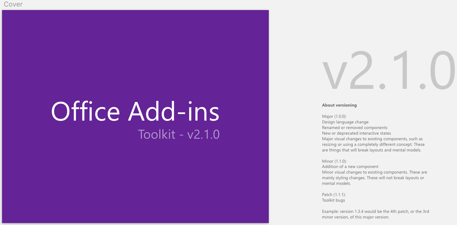
The Cover page of the Add-ins Toolkit.
The toolkit's introduction outlines how it's intended to be used and how it's segmented, as well as a brief description of each section.
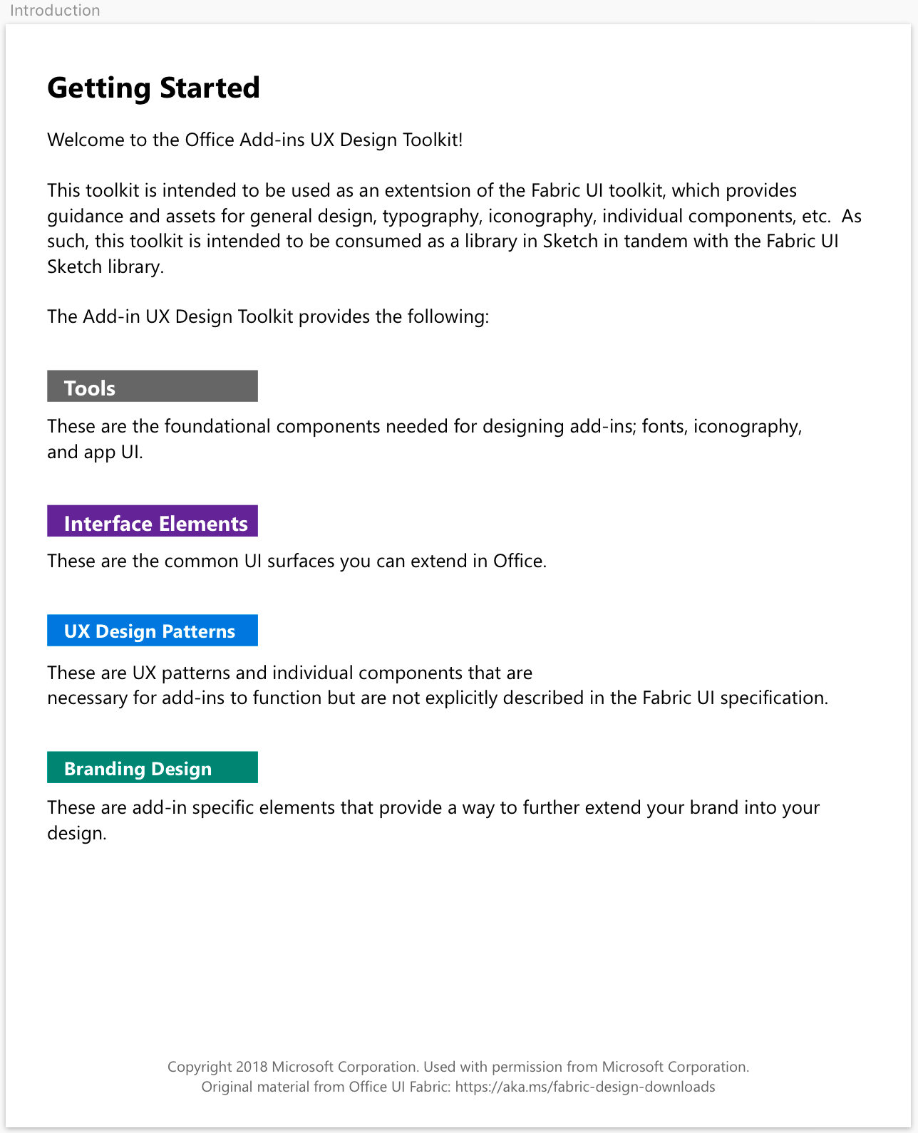
The Introductory section of the Add-ins Toolkit.
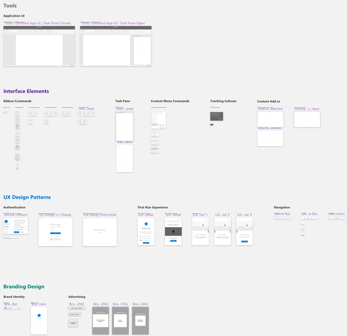
We begin the functional part of the toolkit with the Tools section. This section utilizes a clever font checking technique the Fabric UI team devised to ensure the user has the correct fonts installed, as well as a "ghosted" version of the application chrome and the main add-in surface, the task pane.
Since add-ins are cross-platform and could sit within any of the office products (Word, Powerpoint, Excel), we came up with the ghosted UI to de-emphasize the host application and draw attention to the add-in design itself.
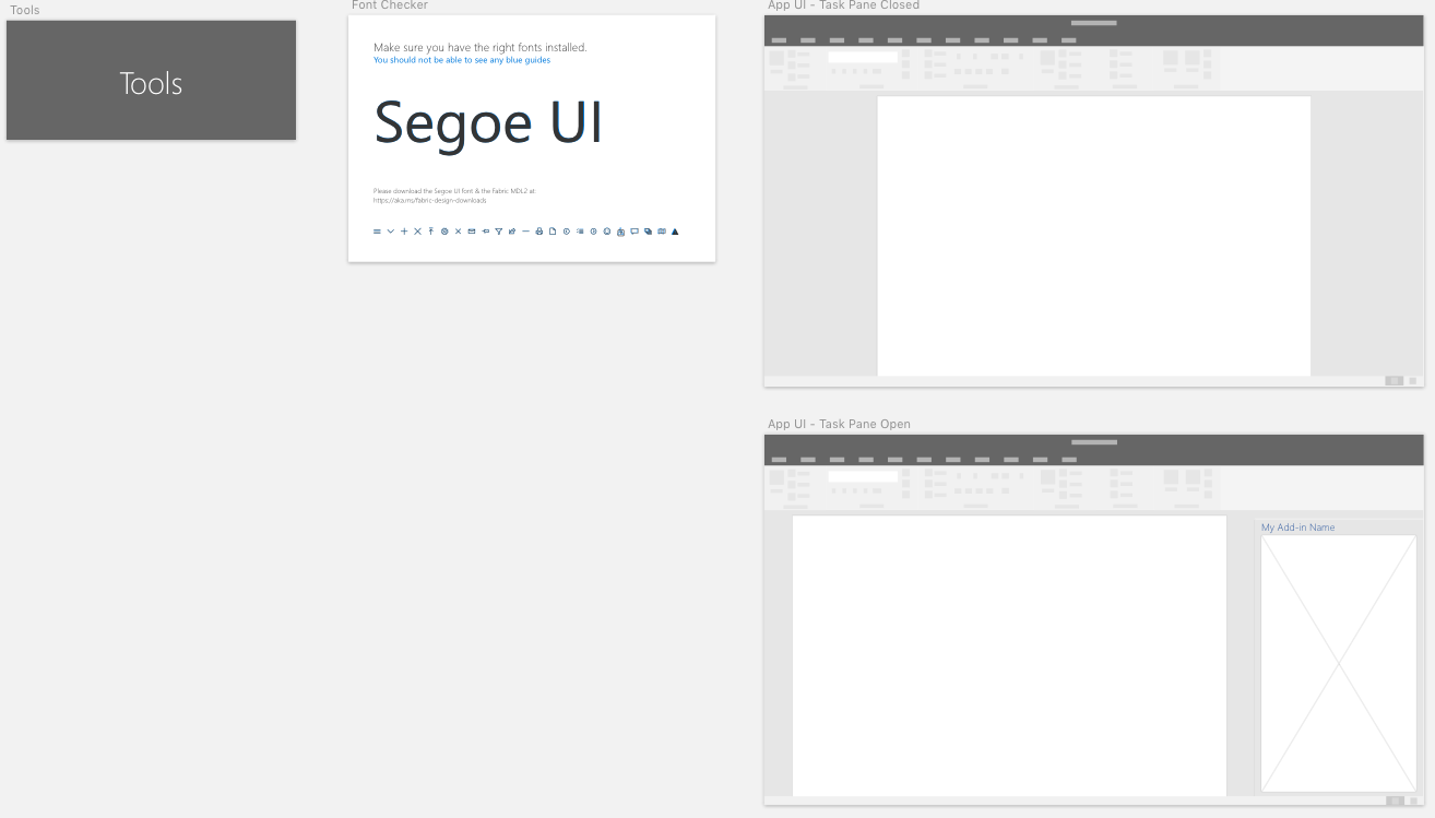
The Tools section of the Add-ins Toolkit.
The next section in the toolkit is Interface Elements. Here we have a collection of components utilized within the various add-in entry points, shown both as individual components or a group of components, and within the application UI.
Each component is built to be easily overridden or modified, thus increasing the speed and fidelity with which wireframes and/or click-through prototypes can be built.
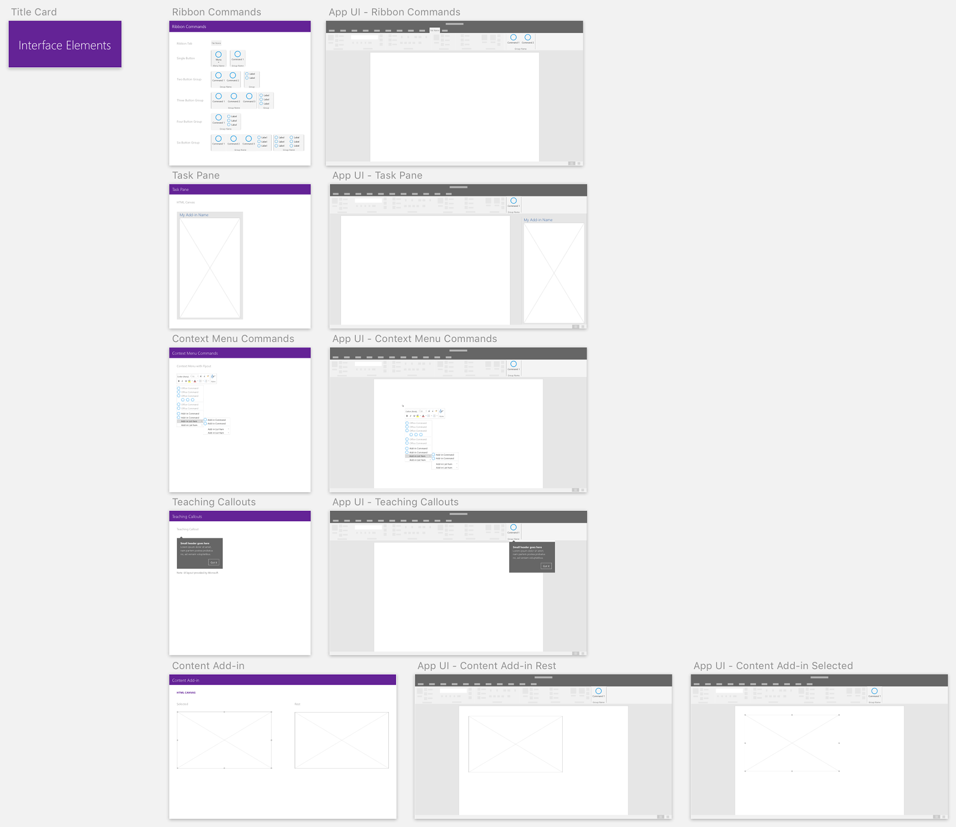
The Interface Elements section of the Add-ins Toolkit.
Arguably the most important section of the toolkit, UX Design Patterns provide guidance on three of the most important interactions a user will have with an add-in: authentication, a first-run experience, and navigation.
Authentication is key to providing access to most add-ins cloud data and key features.
A first-run experience is a key on-boarding tool that helps users understand the benefits of using an add-in as well as how to use the add-in.
A central part to any UI, the add-ins navigation patterns are unique to task pane's dimensions. While the command bar is an adaptation of the Fabric UI component, the tab bar and back buttons are unique to the task pane surface.
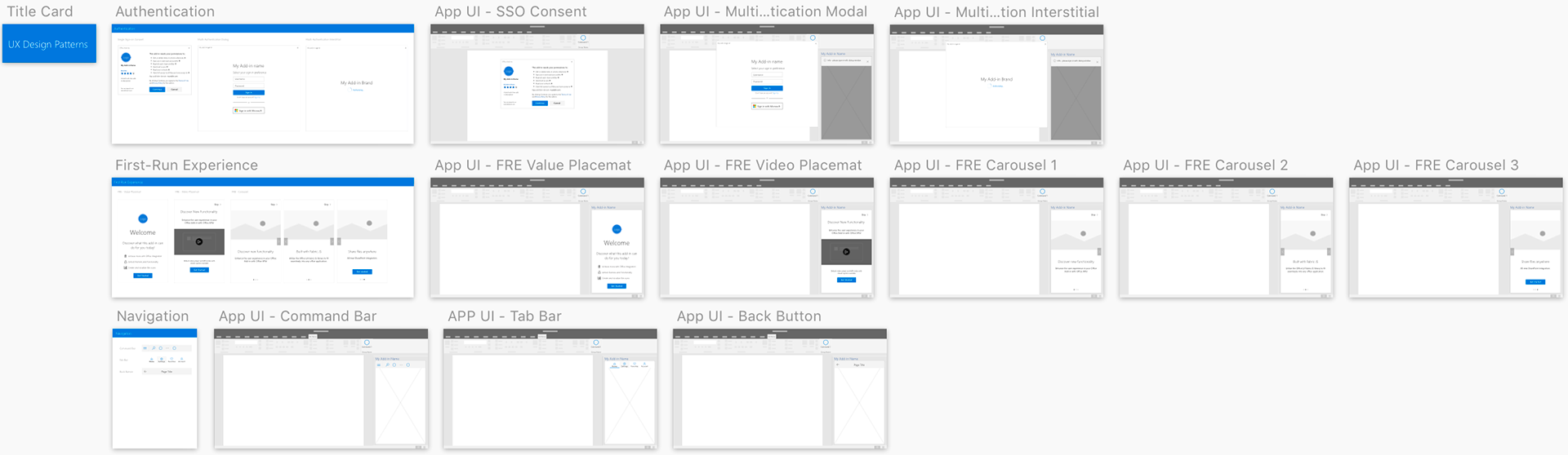
The UX Design Patterns section of the Add-ins Toolkit.
The Branding Design section of the toolkit provides Microsoft's partners several ways to bring their unique branding into the design of the add-in whilst maintaining the overall visual look and feel of the office application.
This section includes the a branded navigational element, called the brand bar, that is designed to sit at the bottom of the task pane canvas, display the unique brand of the entity, and provide an entry point to some type of settings.
Additionally, an add-in developer can brand an interstitial splash screen that can be displayed while the user is being authenticated or while the requested data is being loaded into the add-in (or any time an interstitial loading screen is appropriate).
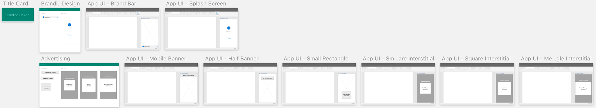
The Branding Design section of the Add-ins Toolkit.
Most recently we added "Advertising" to the Branding Design section. This was a bit of a challenging design as the nature of an add-in is to extend the functionality of the core application as well as the overall productivity of the user. Anyone who has used the internet will have a keen understanding of how advertising is more often than not at odds with productivity - or user experience, for that matter.
That being said, Microsoft has partnerships with many companies that have an ad-based revenue model, and since the task pane is an HTML canvas, there were several partner companies either already serving ads in add-ins or were working with us already to study how ads could impact the usage of their add-in.
We decided to be proactive about it and develop some best practices for ads in add-ins utilizing Microsoft's internal guidelines on advertising within applications, as well as external resources such as the IAB and The Coalition for Better Ads.
This is a deep topic, so I plan to do a more in-depth recap down the road and link to it here.
The symbols page of the Add-ins Toolkit.
As with any Sketch document that utilizes symbols, the add-ins toolkit has a symbols page. This page is where the "master" symbol can be found and edited to effect all instances of a particular symbol.
Being that the Office UI Fabric and Add-ins Toolkits are publicly published and available toolkits, it was important to ensure the symbols pages were well organized and easily understandable.
Getting the Word Out
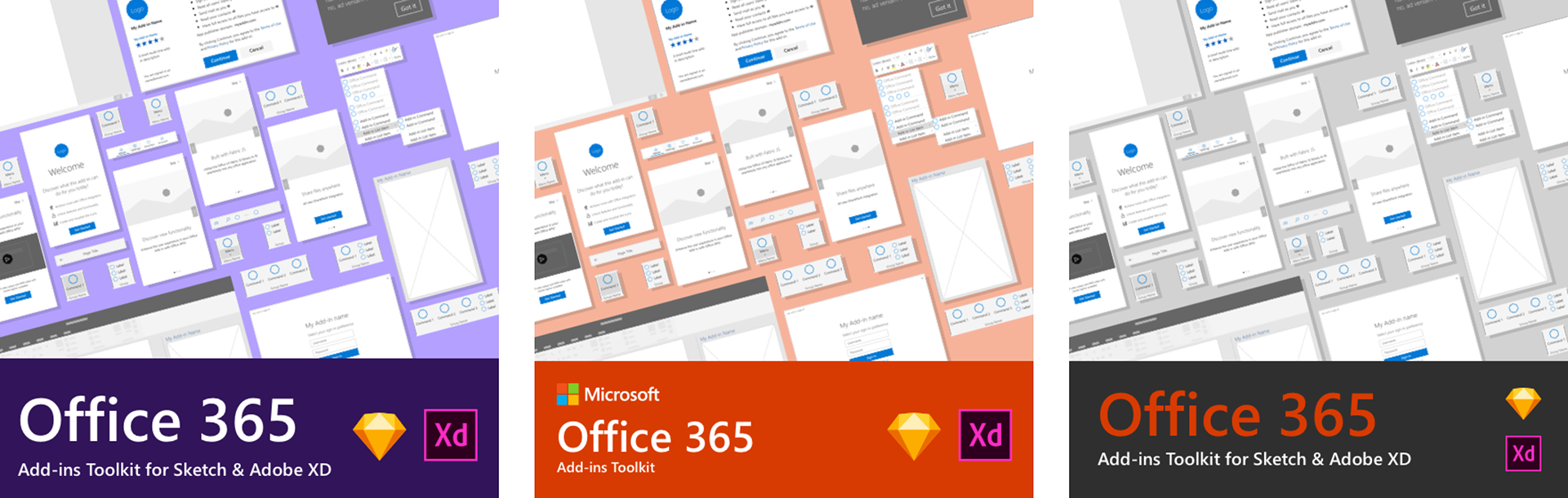
Once the toolkits were built, tested, and published, we needed to get the word out. To accomplish this, we published a post on the @officedev twitter channel to let add-ins designers and developers everywhere know they had a powerful new tool at their disposal.
I helped in this effort by assisting with writing some of the copy and designing the image used in the post.
The design for this post, as simple as it was, had a few requirements:
- Show what design tools the toolkits were available on
- Utilize Microsoft branding and design guidelines
- Give the audience a taste of the look and feel of the toolkit itself
- Design the image to visually fit with the cannon of content previously posted to @officedev.
An example of content previously posted to the @officedev channel and a benchmark for the image I would be designing.

Several color combinations were explored based on Office UI Fabric Design Language colors.
Exploring color, layout, iconography, and typography
Demonstration, Talks, and Build 2018
In addition to our social media efforts, the manager of our team and senior designer at Microsoft, Jeff Dunn, gave a talk and toolkit demonstration at Microsoft Build 2018. In his talk, Jeff gave conference goers a look at the new Adobe XD toolkit as well as an excellent demonstration on how to utilize the toolkit to "quickly visualize and validate Word, Excel or PowerPoint add-ins with the Office Add-ins Design toolkit..." and provide "some design tips and tricks to get the most out of these resources and create the best experiences with Fabric."
Microsoft Senior Designer Jeff Dunn presenting at Microsoft Build Conference 2018
Documentation
Another large part of my role was contributing both writing and visual design to the Office Add-ins Documentation. Having designed the toolkits, I was asked to write documentation for four UX design patterns referenced within the toolkits, as well as provide the supporting visuals.
The four patterns were:
- Branding
All documentation was written in markdown and pushed up to Microsoft's documentation repository on GitHub.
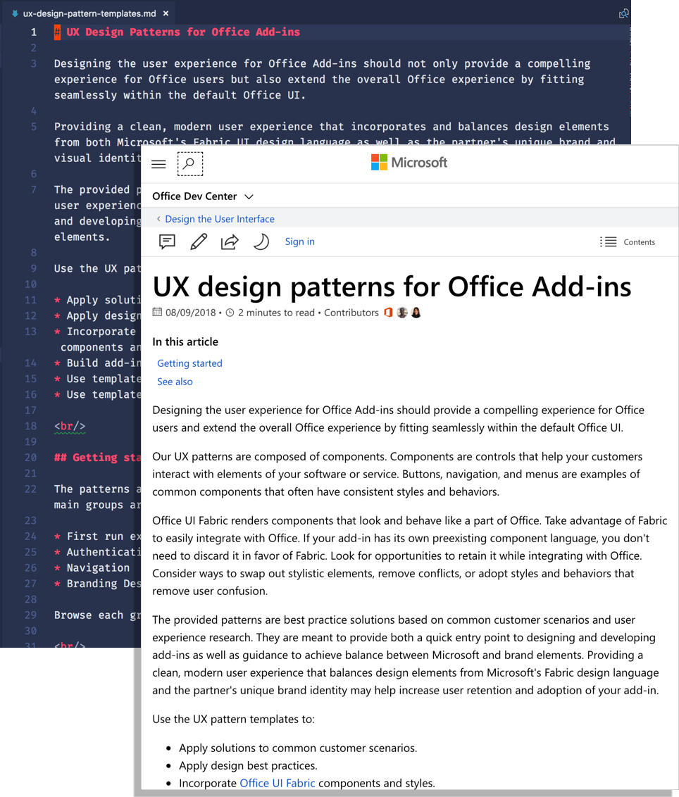
An example of documentation written in markdown and as rendered by the Office Dev Center website.
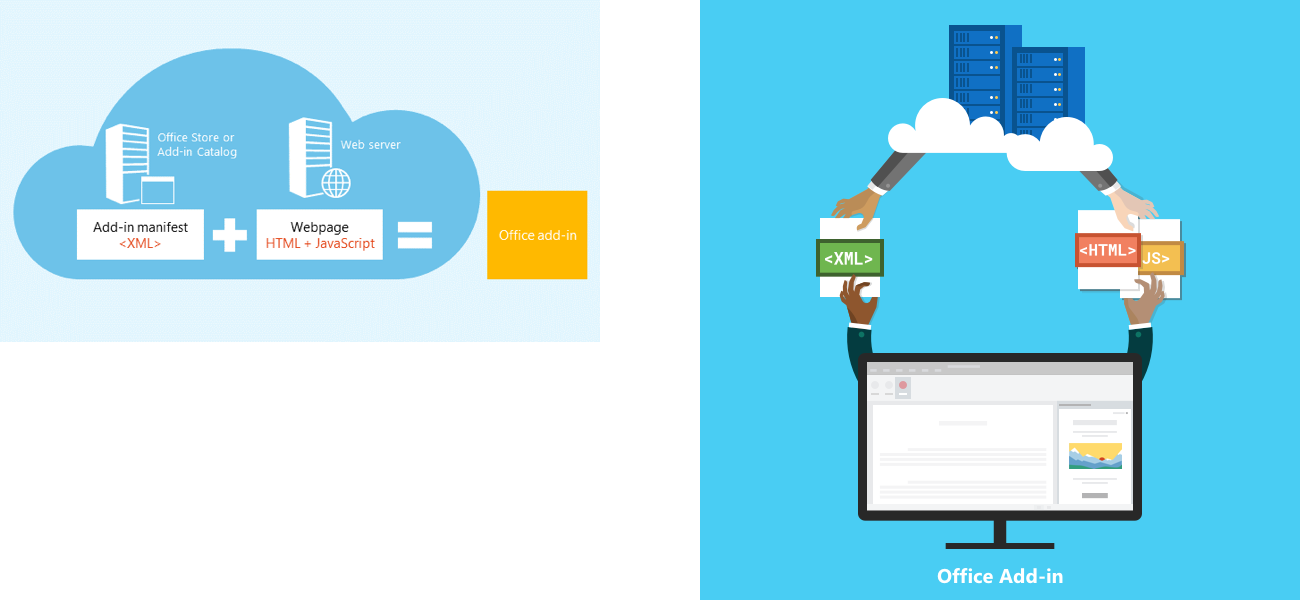
Additionally, I redesigned visual assets for the About Office Add-ins page. For this task, I needed to design custom assets that communicated somewhat abstract technical concepts related to the components of add-ins, while also incorporating Microsoft's visual design guidelines.
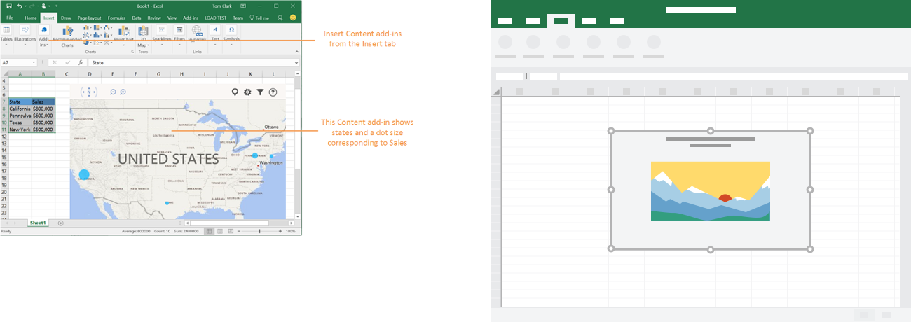
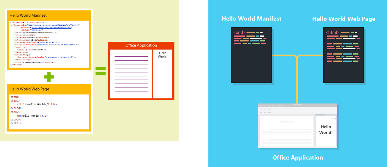
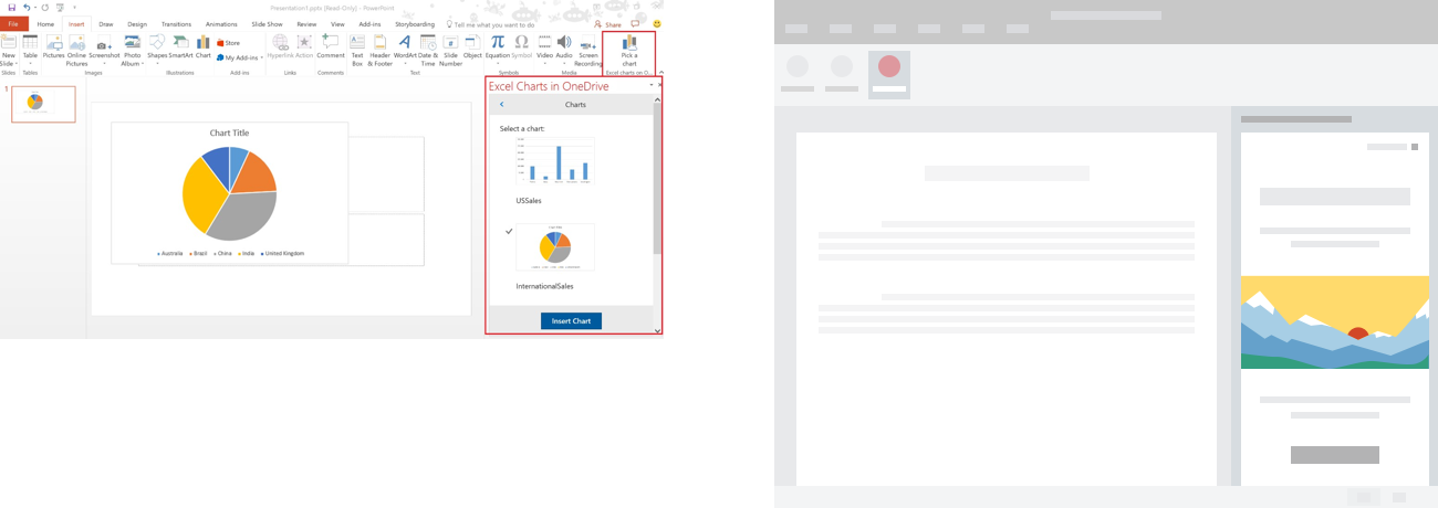
Here we can see the original images vs. the updated designs:
Old Image (L) and Updated Image (R)
Old Image (L) and Updated Image (R)
Old Image (L) and Updated Image (R)
Old Image (L) and Updated Image (R)
Old Image (L) and Updated Image (R)
You can find the toolkits for both Fabric UI and the Add-ins Toolkits here:
Add-in Sketch Toolkit - aka.ms/addins_sketch_toolkit
Add-in XD Toolkit - aka.ms/addins_toolkit
Fabric UI Resources - developer.microsoft.com/en-us/fabric#/resources
