

Add-in Design & Data Visualization for Streaming IoT Data in Excel
Introduction
In March of 2018, our team was approached by a group of project managers that had been working with some of Microsoft's partners to present at Microsoft's upcoming Build Conference. This particular partner, London-based company Hanhaa, had developed Hanhaa Mobile - a global GSM network "dedicated to the unique needs of the Internet of Things", as well as a number of IoT devices that cleverly utilize this network.
The device Hanhaa was presenting at Build, called Symbisa, has an array of 6 sensors on-board; Humidity, Temperature, Pressure, Light, Orientation, GPS. Hanhaa was able to stream live data from these sensors into a spreadsheet using a preview version of the new custom functions feature in Excel, and wanted to round out the experience by building an add-in.
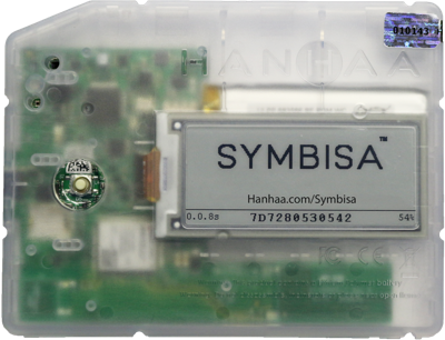
Hanhaa's Symbisa IoT Device
Being that the custom functions feature is still in preview, it may need a bit more explanation to provide proper context for this write up. Here's a brief summary from the Custom Functions Overview page on Office Dev Center:
"Custom functions enable developers to add new functions to Excel by defining those functions in JavaScript as part of an add-in. Users within Excel can access custom functions just as they would any native function in Excel, such as SUM()."
In Hanhaa's case, they had already built the custom functions that would allow a user to access the streams of data from a Symbisa device's sensors from within a spreadsheet, and now needed to round out the add-in's experience by providing access to more traditional UI elements like login, device list, device details, etc.
Design Process
After the initial meetings with Hanhaa that helped our team understand the Symbisa device's capabilities, who their target user was and how Hanhaa envisioned them utilizing the device, we needed to scope the project.
Our first challenge was setting an appropriate scope for the time frame - just under two months - as well as planning to launch an MVP in time for Build that was complete enough to demonstrate the desired features with enough design done that it would be easy for the Hanhaa team to ramp back up and finish building the add-in once time and resources were more readily available after the conference.
Other challenges on this project included:
- Working with an international team (Time zone difference, Communication delays)
- Working towards an MVP for demonstration instead of final product
- Modern Fabric implementation
The Prototype
Fortunately for us, the engineering team at Hanhaa had already built a bare bones prototype of the add-in, which was complete enough to get a great feel for how they intended the add-in to function, as well as serving as a way I could work hands-on with the add-in to better understand how it interfaced with the Symbisa device and the spreadsheet.
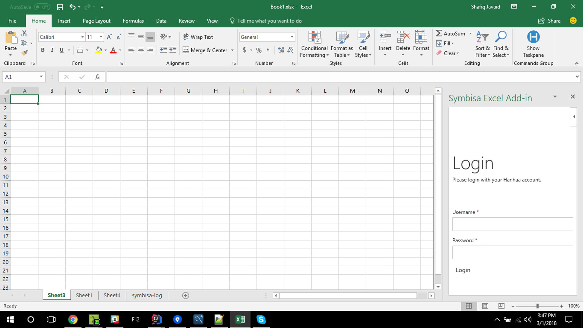
Symbisa Login Screen (Early Build by Hanhaa team)
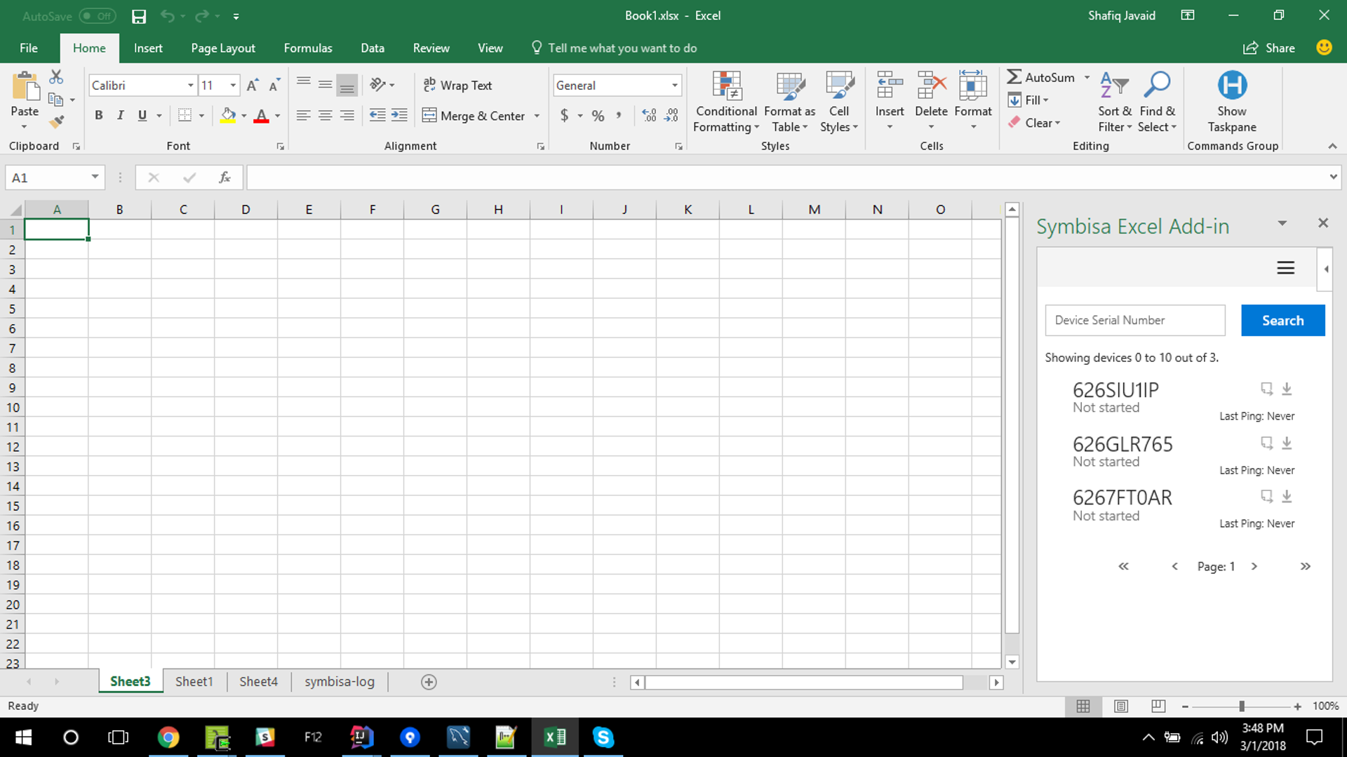
Symbisa Device List (Early Build by Hanhaa team)
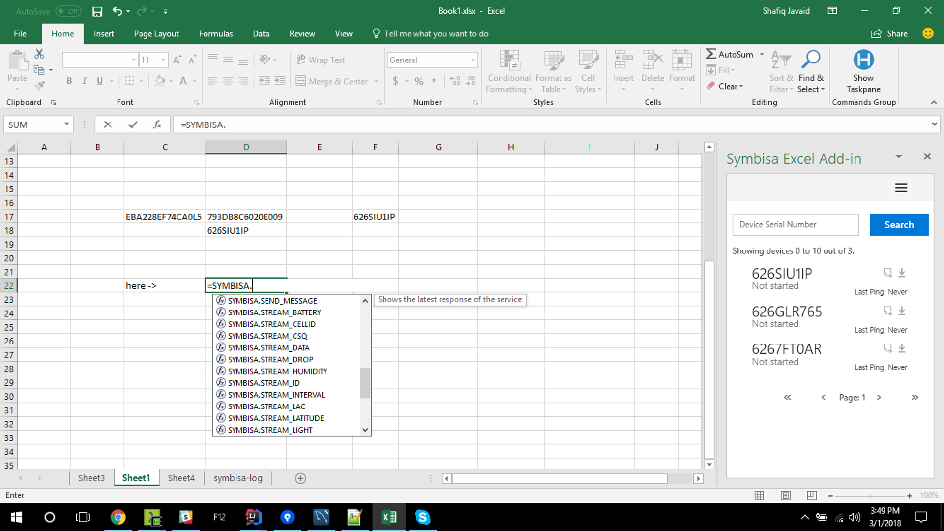
Symbisa Custom Function Entry (Early Build by Hanhaa team)
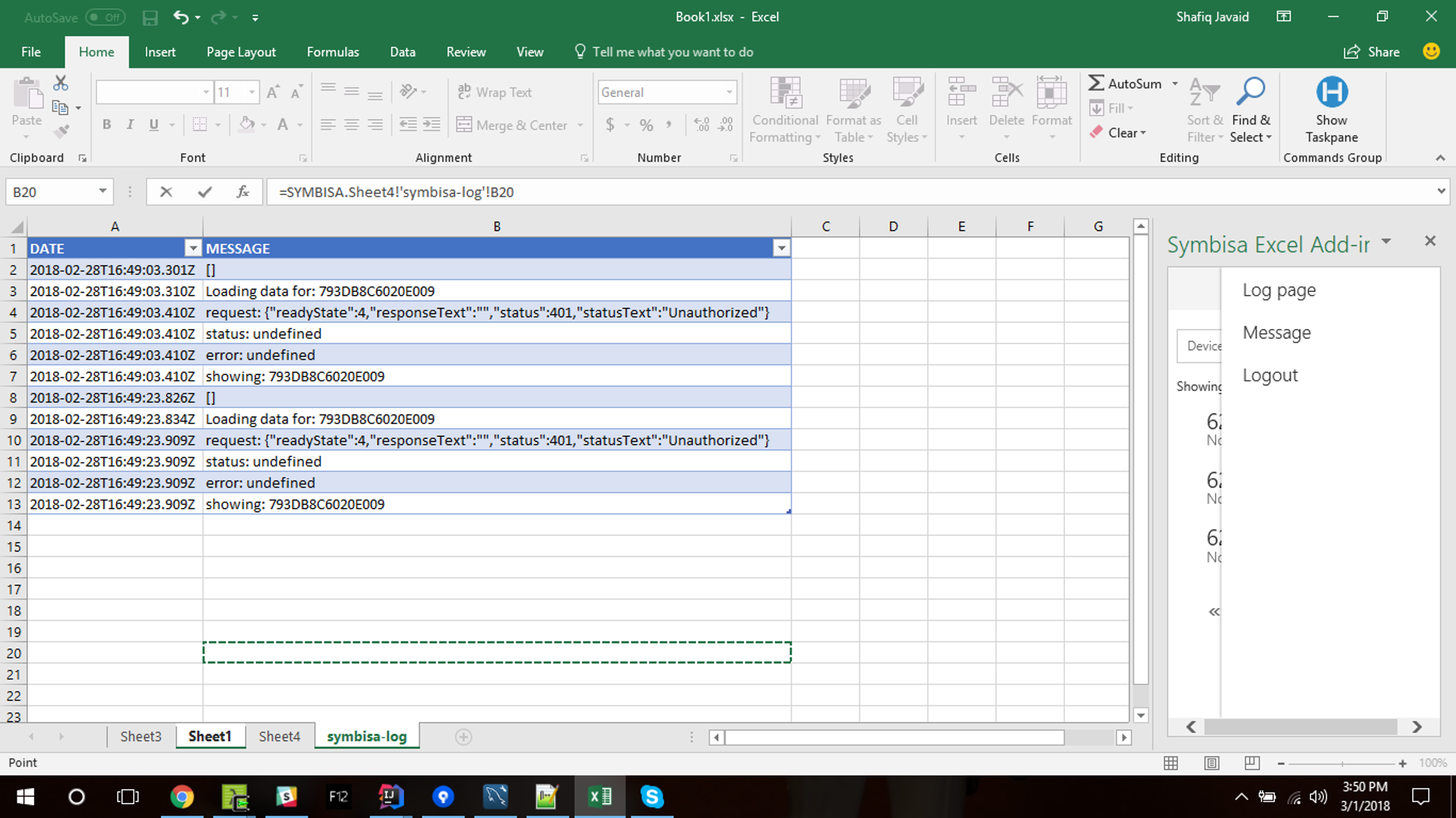
Symbisa Device Error Log (Early Build by Hanhaa team)

Symbisa Device Data Streaming in Excel (Early Build by Hanhaa team)
Ideation
With a good understanding of Hanhaa's goals for the add-in experience, I began to sketch out some thoughts on how the current prototype would be built utilizing Fabric UI components as well as thinking through the experience holistically and created a few simple personas, with which to view any new ideas through a particular lens.
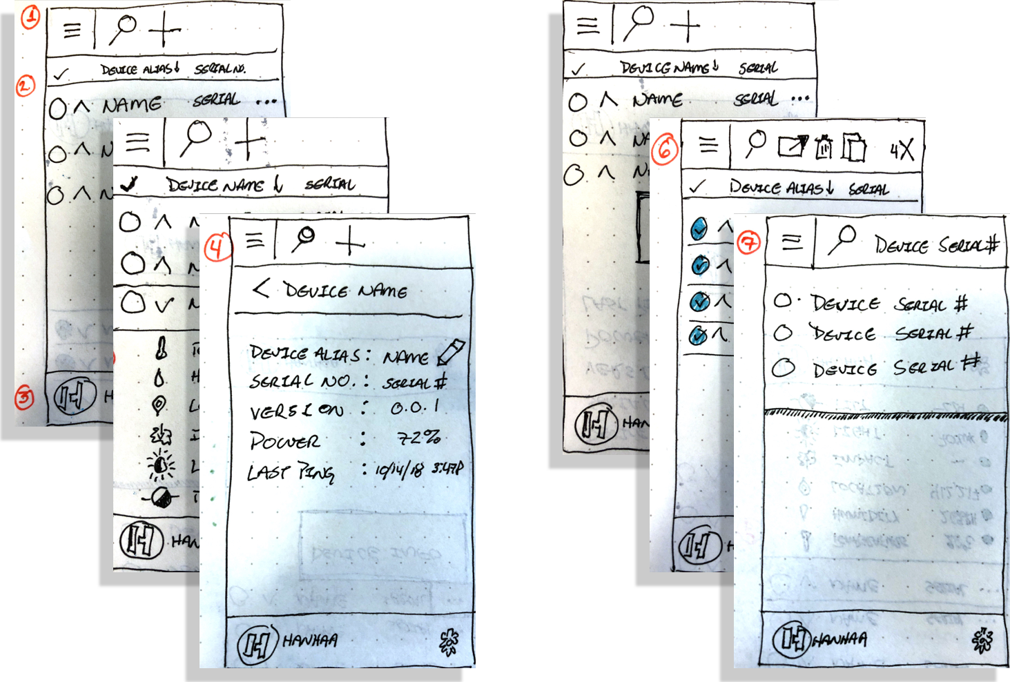
Some of My Initial Sketches for the Symbisa Excel Add-in
There were several observations I made initially as I worked with the Symbisa prototype that would help me shape my approach to designing the add-in experience:
- There was more (useful) data being generated than was being surfaced within the add-in prototype
- The stated intent of the Symbisa device's integration with Excel via the add-in and custom functions was to "enable customers to use the device straight out of the box, without any sort of
programming skills or coding experience required" - a goal that was not quite met at this early stage.
programming skills or coding experience required" - a goal that was not quite met at this early stage.
- The Hanhaa engineer working on UI wasn't familiar with the React framework and had to build UI from the deprecated Fabric Angular source due to time constraints. This made the UI presented in the Build demonstration not up-to-date with the current Fabric design language and guidelines.
Bringing it All Together
After several weeks of virtual meetings, review sessions, and deep dives with technical subject matter experts, I presented the following design for the Symbisa Excel add-in experience to the Hanhaa team. It was still a ways away from being a final product, but it was a design that gave the engineers at Hanhaa enough of a roadmap for the add-in to build a prototype for the Build demonstration, as well as plenty of ideas to experiment with post-Build 2018.
The screens below give a brief example of some of the presentation notes and recommendations I provided in my presentation.
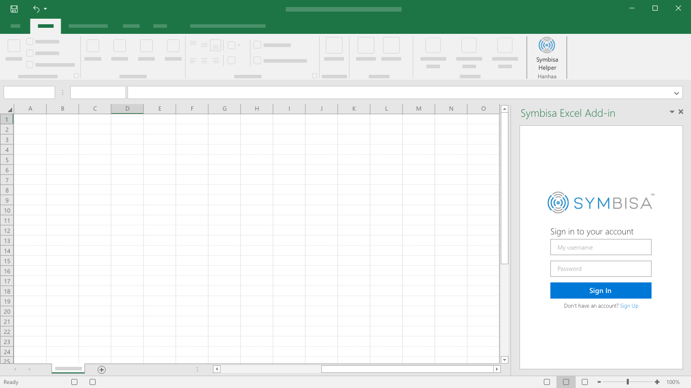
Login
Account login page with Symbisa branding.
The ribbon button which launches the task pane should contain some branding and a short name or phrase that communicates it’s purpose to the user.
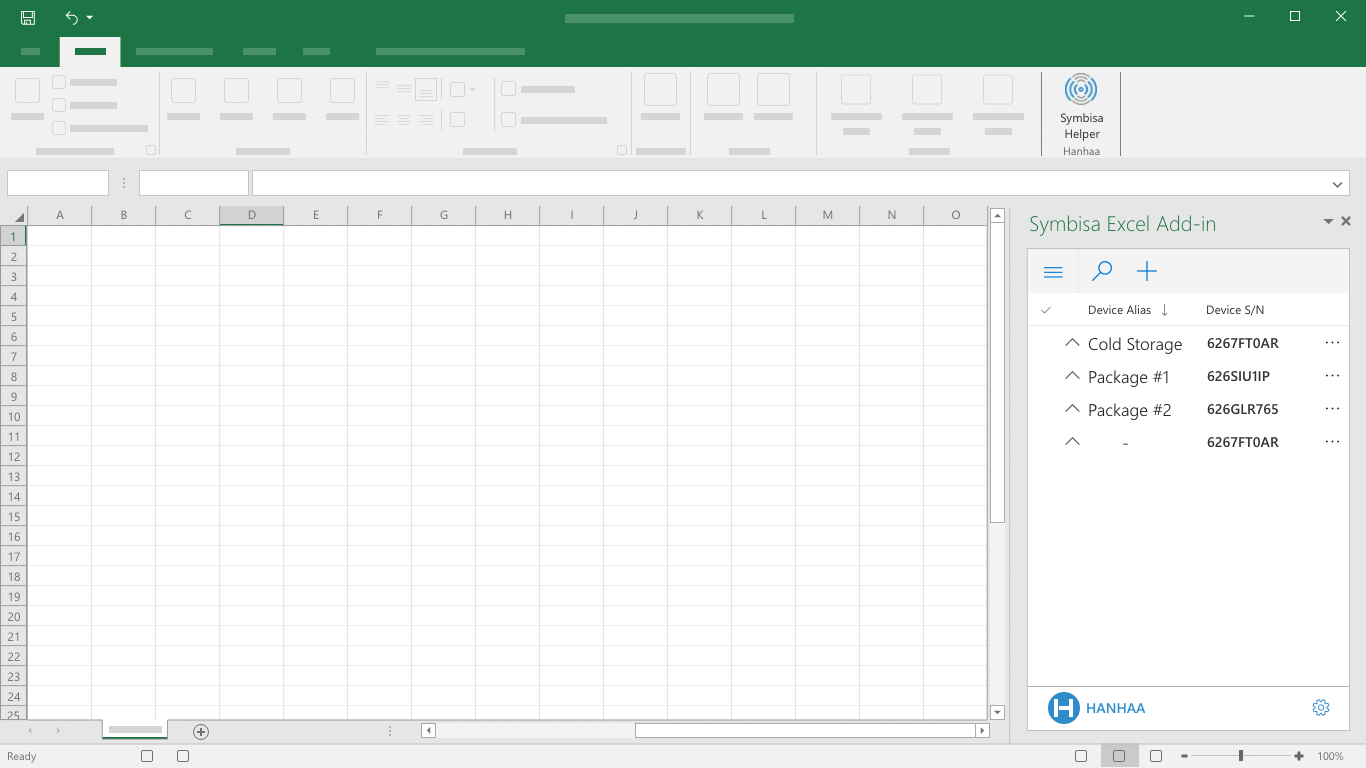
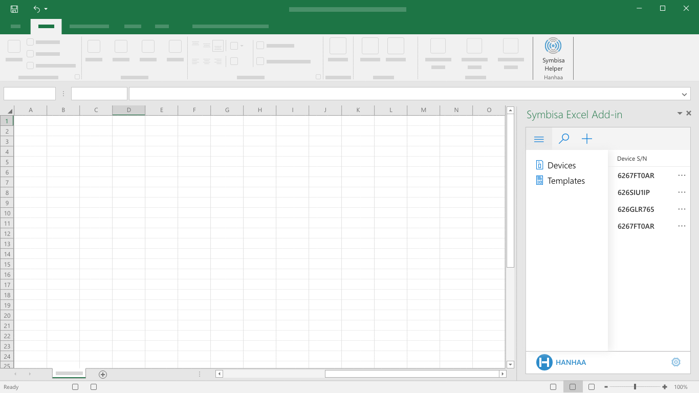
Device List
The device list will be populated with all devices associated with the user’s account.
The command bar should provide global options: main menu, search, add device, etc.

Search
When the search field is selected, it will expand to encompass the entire command bar, right of the menu button.
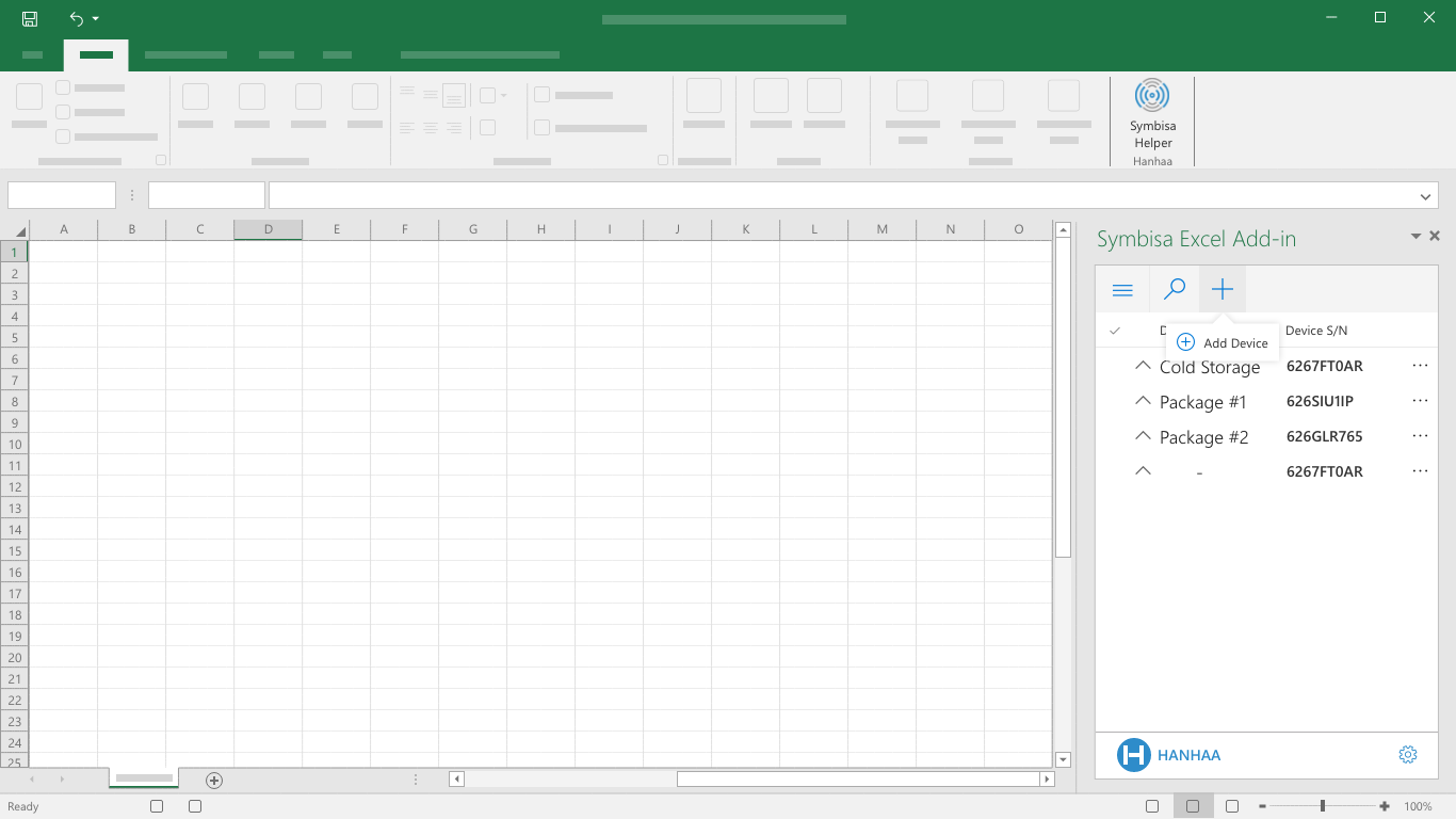
Add Device
This illustration provides a glimpse at how a user could add a device within the add-in (as opposed to adding a device through the Symbisa web application).
Get Device Information
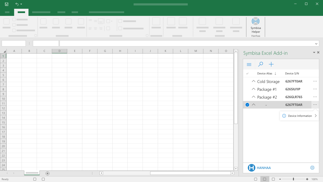
Each device in the device list has an over-flow menu which provides the user an entry point to the device information screen.
Selecting the “Device Information” drop down takes the user to a new screen within the task pane (see next screen).
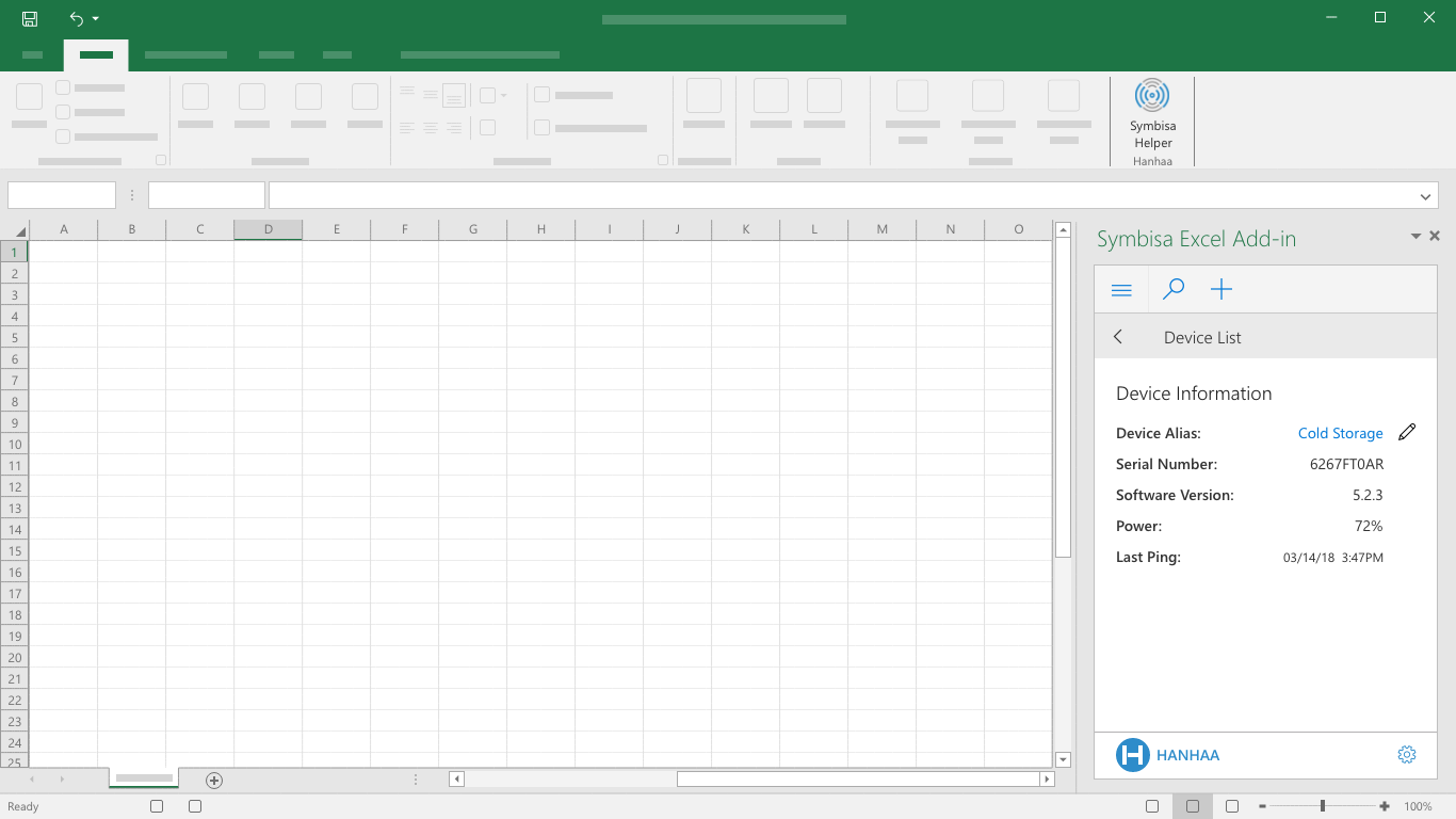
Device Information
The device information screen provides the user device-level information, as well as a way to add/edit a custom device alias.
The (back) button just above the device details provides the user a way back to the device list.
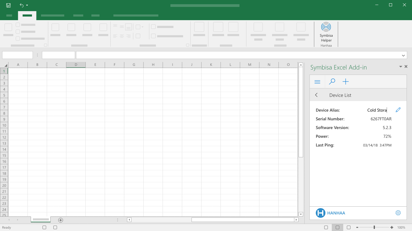
Change Device Alias
Selecting the "Edit" icon will make the device alias editable by the user. Once the desired alias is entered, the user can then either select the "Edit" icon or hit "return".
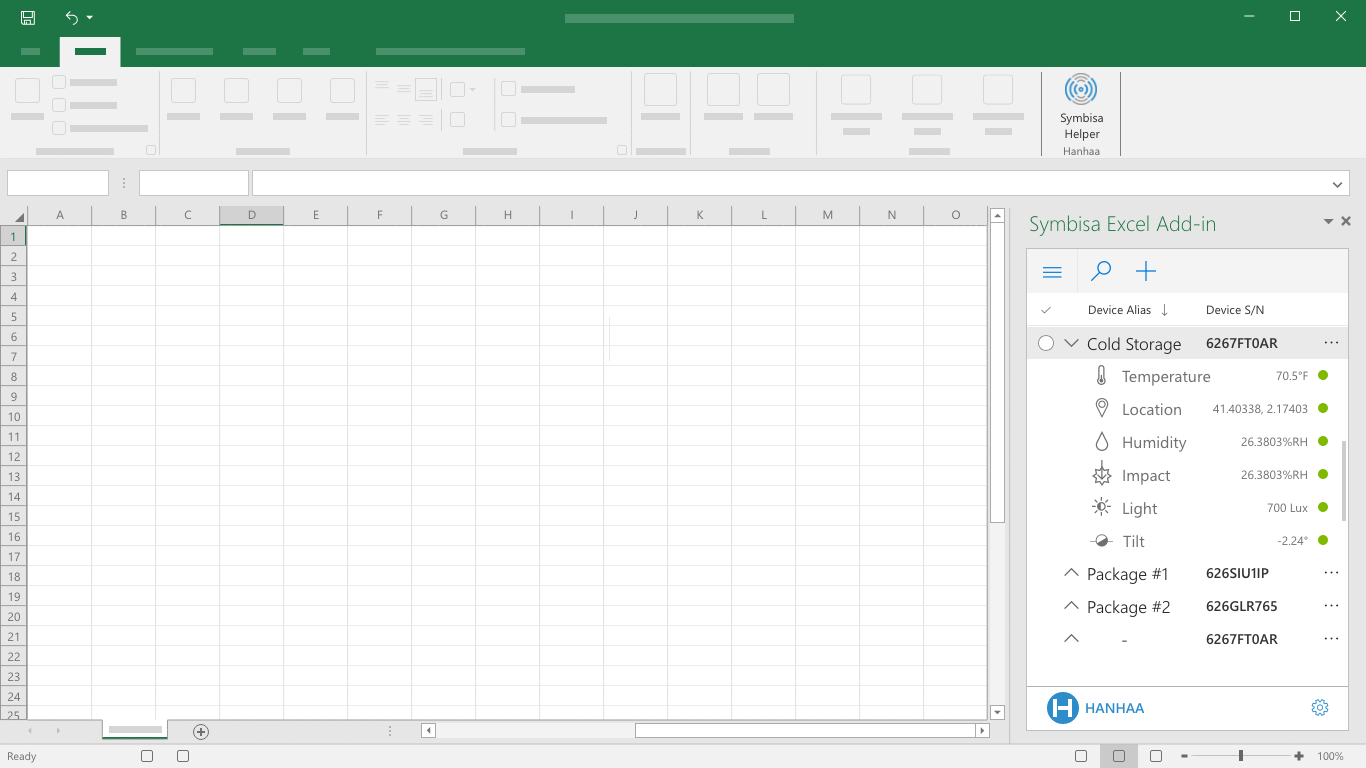
Expanded List Item (Live Sensor Data Display)
Each device in the device list is able to expand to reveal a sensor list with streaming sensor data and a visual indication of sensor status.
Open Menu
The menu pane expands when the menu icon has been selected.
This menu should an entry point to the highest level options. For example, if example templates were implemented, this surface would be the best place to provide a user the ability to select between the device list and a template list.
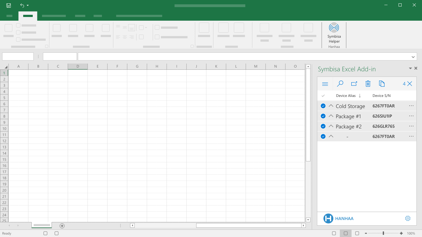
Multi-select
The multi-select checkboxes (or circles) are visible upon hover.
Upon selection (single or multiple), the command bar changes and provides the user with new options: insert, delete, copy serial number, and clear selection (as number of selected devices).
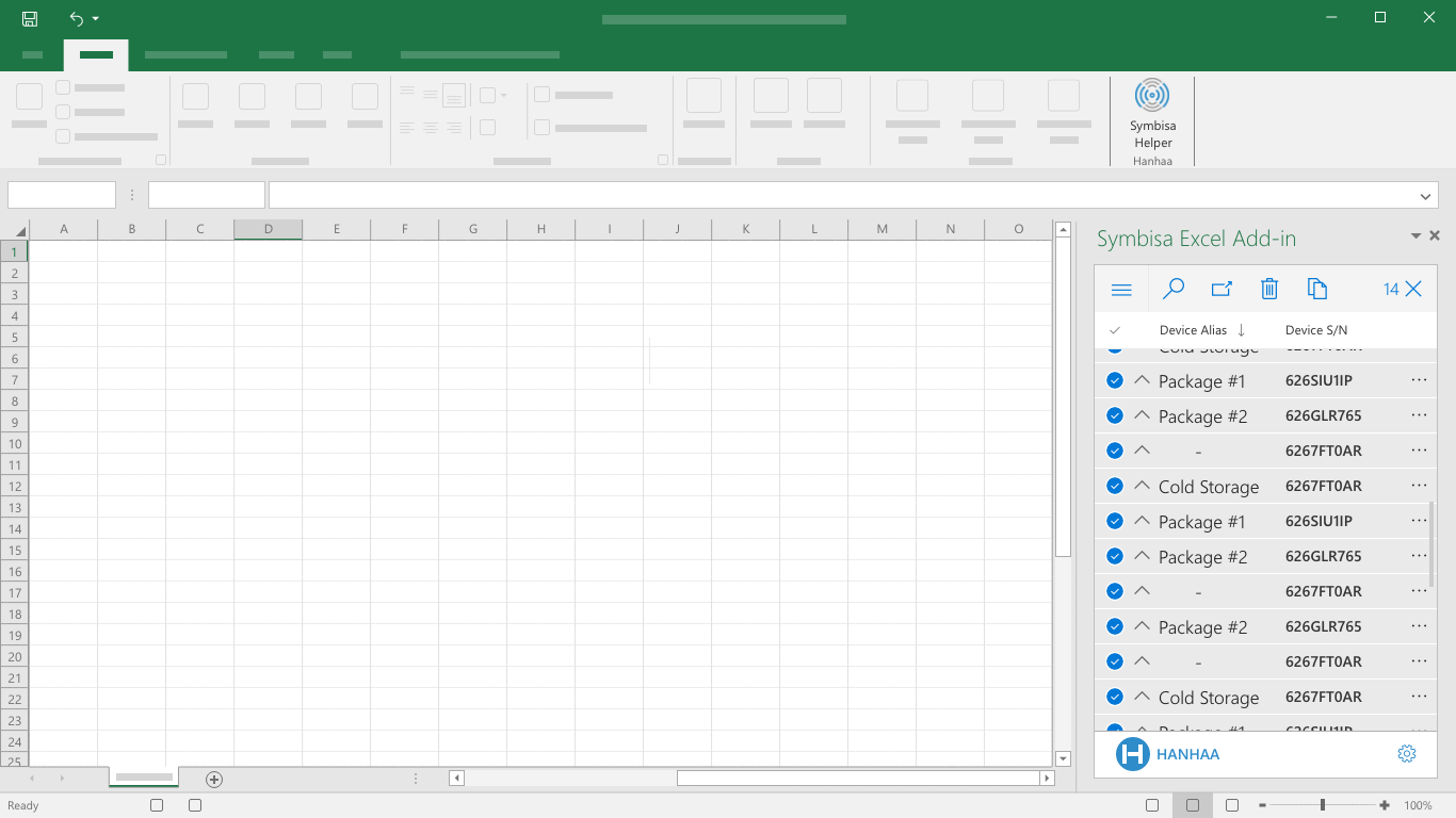
Multi-select Overflow
This image illustrates how a multi-selection of more devices that can fit at once within the task pane would work.
From a user perspective, an infinite scroll is generally a more favorable experience than using pagination, but possible technical limitations may exist.

Settings
The brand bar contains the gear icon, which provides the user access to account settings, reference sheets, and a way to sign out of their Symbisa/Hanhaa account.
The reference sheets mentioned are a way to provide the user two sheets – one with a list of available custom functions and how to use them, and one populated with a list of the aliases and serial numbers of all associated devices.
The Data Visualization Situation
After a successful presentation to the Hanhaa team, we fell into a pattern of design support and clarification. Two weeks before the presentation deadline, Hanhaa reached out to let us know they were unable to facilitate any design or build of the planned dashboard view in Excel that would come to life with colorful visuals and show the data streaming into the spreadsheet.
Having done some data design in previous positions and with data visualization experts within arms reach to provide insight and support, I volunteered to take a crack at both the design of the dashboard and building it excel.
With time and expertise both a factor, I aimed to keep these visualizations as simple as possible - both visually and in functionality.
To start, I worked with some designers from the excel team to better understand the visualization capabilities of Excel. We determined that simple visual overlays with conditional formatting would be the most effective means for communicating the data streaming into the spreadsheet with the time we had to build the visualizations.
I sketched out a few thoughts for how we could represent the data streaming into the spreadsheet from the different sensors on the Symbisa device and began to research the best way to begin building these visualizations.
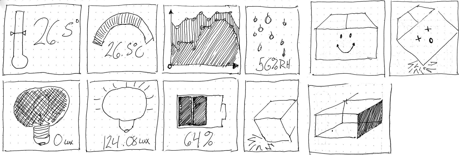
Initial Sketches for Data Visualization in the Symbisa Dashboard.
I utilized an INDEX/MATCH function (as opposed to a VLOOKUP function) to call and display the different images to a target cell when certain values or a range of values were detected as data streamed into the sheet from the Symbisa device.
For example:
=INDEX($A$3:$B$4,MATCH($D$4,$A$3:$A$4,0),2)
I chose to go with INDEX/MATCH for a few reasons:
1. No Character Limit - In VLOOKUP, a value's character limit is 255 characters. As some of the data streamed into the cells from the Symbisa device could contain lengthy strings, this was a limit that made me wary.
2. More Performant - In very large sets of data, Excel only has to process the lookup and return columns for INDEX/MATCH, whereas VLOOKUP processes the entire table array.
3. Most importantly, I got it to work.
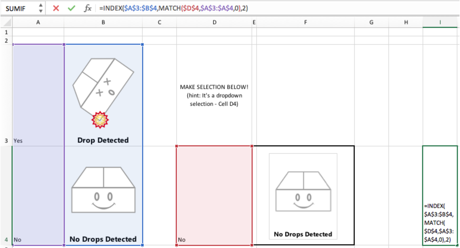
The Drop Detection prototype utilizing INDEX/MATCH function.
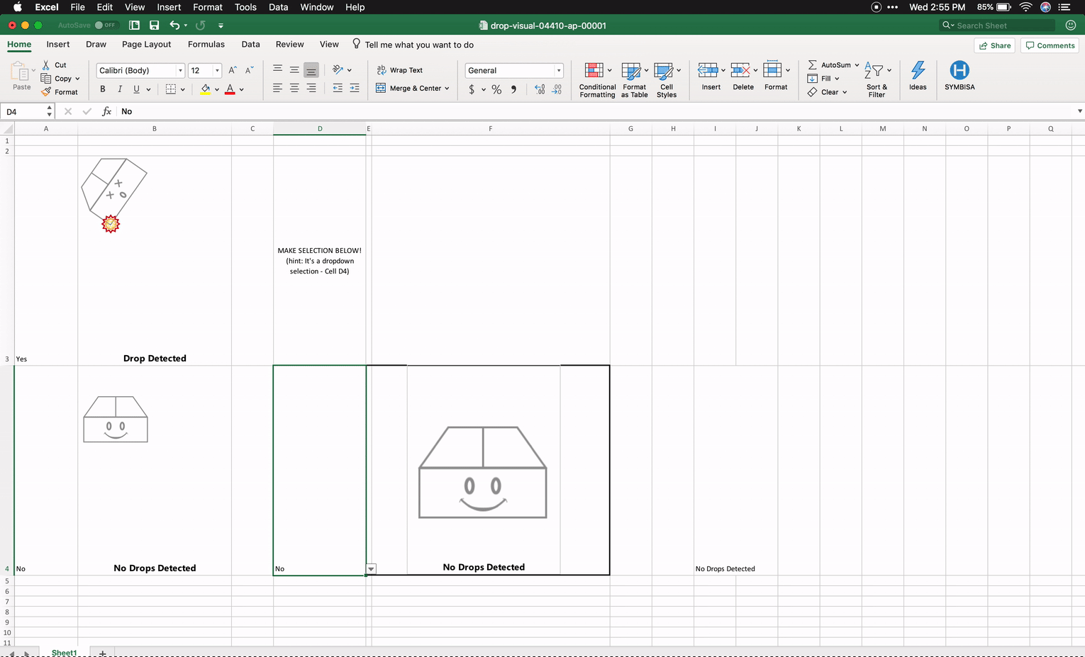
The Drop Detection prototype in action.
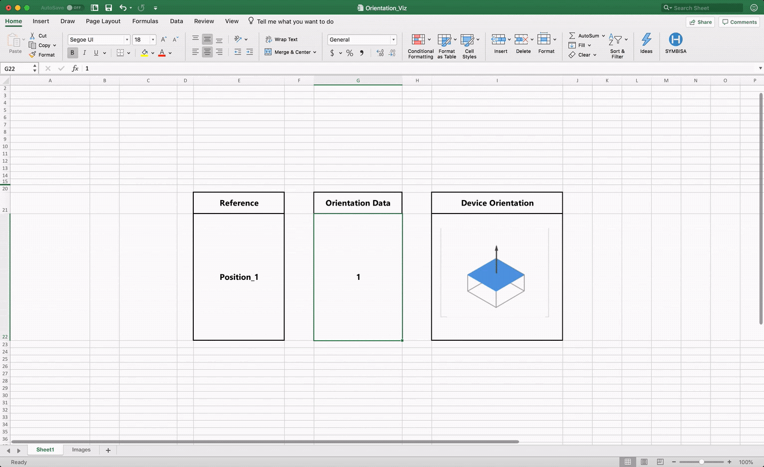
The Orientation prototype in action
The Presentation
All-in-all, we designed and built visualization prototypes for luminosity, temperature, orientation, battery charge, and drop detection for Hanhaa to review and use in their Build 2018 presentation. All but drop detection were utilized in the presentation due to both time constraints and a misalignment with how drop detection is effectively calculated with the Symbisa device and it's visual representation as designed.
With our prototypes in hand, the Hanhaa team build a rudimentary dashboard in the spreadsheet, tailored to their presentation. We were all systems go!
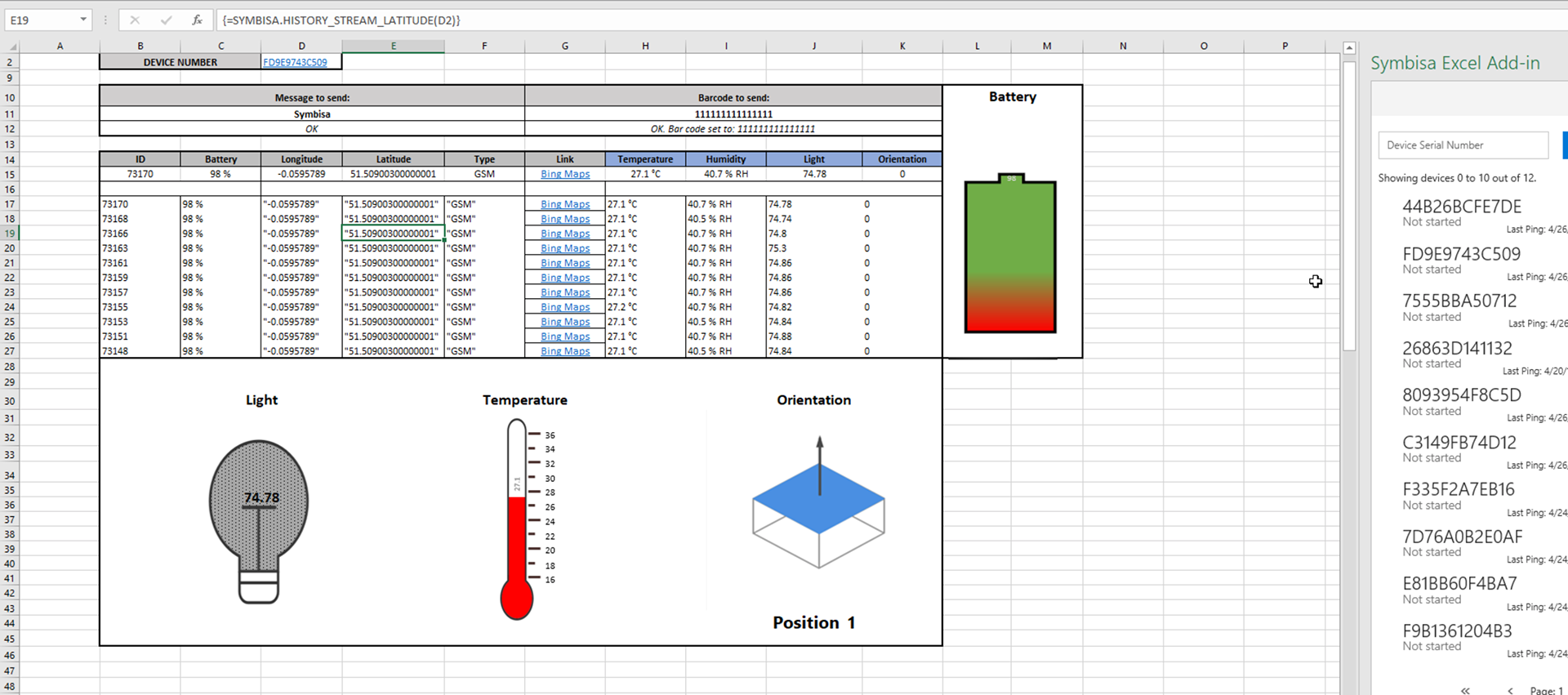
The presentation dashboard as finalized by the Hanhaa team.
You can see Adrien from Hanhaa present our work at Microsoft Build 2018 below:
Post Script
Several months after a successful presentation at Build 2018, Hanhaa wanted to update and streamline the dashboard design for another presentation. For this demonstration, they wanted to track a few data points for multiple devices in the spreadsheet.
For this design, I relied on conditional formatting and simple visual overlays to do the communicating for the Symbisa sensors. Battery and luminosity were visualized with cell fills that increased or decreased with higher or lower values and temperature was simply conditionally formatted text colors that corresponded to hotter or cooler temperatures.
The result was a simpler, easier to read, and more performant dashboard that made for another knockout presentation.

